
A quick intro
By now you’ve most likely heard of frameworks such as Bootstrap, Material-UI or Tailwind CSS, among many others. These frameworks are usually easy to use, and offer some of the most accessible tools to build web platforms, specially for entry-level developers. They also help greatly in maintaining a certain level of UI homogenisation with minimal effort.
Initially, these tools were developed for direct JavaScript usage (or with JQuery on the side), without having any other coding framework on top (i.e. React, Angular, Vue.js, etc.). To put it simply, and focusing on Bootstrap, for example, they offer a very large set of CSS classes that can easily transform a native browser <button> element into a good-looking one, just by adding the attribute class="button" to it.
In addition to the CSS offered by Bootstrap, it also has its own set of JS scripts, that provide utilities, animations and behaviours to use together with many HTML elements. For example, say you wanted a “dropdown” selector, you could implement one easily with the following code:
<div class="dropdown">
  <a class="btn btn-secondary dropdown-toggle" href="#" role="button" data-bs-toggle="dropdown" aria-expanded="false">
    Dropdown link
  </a>

  <ul class="dropdown-menu">
    <li><a class="dropdown-item" href="#">Action</a></li>
    <li><a class="dropdown-item" href="#">Another action</a></li>
    <li><a class="dropdown-item" href="#">Something else here</a></li>
  </ul>
</div>
This is all fun and games, but what if you wanted to use the same templating in many other places without replicating this code?
Well, …
…actually, it was already possible back then, but it was for sure more complex than it is nowadays.
Let’s just say that, by the end of this article/guide, you will hopefully have learned to do the same dropdown in a more readable, user-friendly way, using React.
Here cometh the React era
With the advent of the aforementioned coding frameworks (like React) in the past decade or so, and with the diminished usage of JQuery, developers quickly looked for ways to migrate those same UI frameworks to use in other, different environments.
In what regards React specifically, there was the necessity to turn some of the various CSS classes into dedicated components. For example, let’s go back to the “dropdown” idea we had before; in React we’d like for it to be as simple as follows:
<Dropdown content={content} />If you could re-use the same dropdown like this, simply by passing different sets of actions depending on their usage, then your work would become much more simplified. On top of this, imagine setting up a common CSS stylesheet to be used equally, for all your dropdown components!
Okay, but you may ask, “that is primarily the job of React already, so what’s the purpose of this article?”
Say you have a service architecture that has several sub-services/platforms that you need to build/manage in similar ways. It would be nice if you could export your component ideas and styles to be used homogeneously across all of them, right?
That is what I will be covering in this article. A fast and maintainable way of creating your own custom React component library, publishing it on npm, and using it in other places.
Setting up the library
Disclaimer: What I will be presenting is merely one of many ways of setting up the components library, in this case using TypeScript, but it could also be done using JavaScript instead, with just some minor tweaks.
Let’s start by creating a new directory, and then we’ll create the following base file structure:
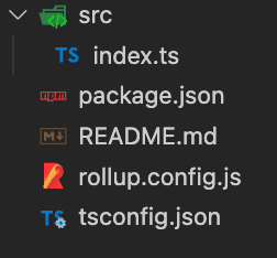
You may have noticed that there are 3 important configuration files.
Firstly, we’ve got package.json, which we always need in order to define the NPM packages we want to use. Let’s take a quick look at the ones I have defined for this library:
"devDependencies": {
    "@rollup/plugin-commonjs": "^22.0.1",
    "@rollup/plugin-node-resolve": "^13.3.0",
    "@rollup/plugin-typescript": "^8.3.4",
    "@types/react": "^18.0.15",
    "@types/react-dom": "^18.0.6",
    "autoprefixer": "^10.4.7",
    "postcss": "^8.4.14",
    "postcss-modules": "^4.3.1",
    "postcss-preset-env": "^7.6.0",
    "rollup": "^2.77.2",
    "rollup-plugin-peer-deps-external": "^2.2.4",
    "rollup-plugin-postcss": "^4.0.2",
    "sass": "^1.51.0",
    "string-hash": "^1.1.3",
    "typescript": "^4.7.4",
    "typescript-plugin-css-modules": "^3.4.0"
  },
  "peerDependencies": {
    "react": "^17.0.2",
    "react-dom": "^17.0.2"
  },
Notice that I’ve left out React and ReactDOM as peer dependencies. This is because we do not want to bundle a version of either of them together with our library code, as that could create a version conflict and the library might not work at all (there are some ways around the issue, but it is much easier to specify that the library should run on whatever versions the other platform already has, as long as it matches the minimum version mentioned in the library).
Nevertheless, I’ve chosen to use React 17 as minimum version for the library, since that already allows to use many native hooks. But feel free to modify the version around your own constraints.
As for the rest of the dependencies, it’s mostly for setting up our Rollup, Typescript, PostCSS and CSS Modules configurations.
We’re not done with the package.json just yet though! We need to define a couple other things first too. Let’s add the following options:
"files": ["dist/**/*"],
"main": "dist/index.cjs.js",
"module": "dist/index.esm.js",
"types": "dist/index.d.ts"
These will be used to tell npm what to look for when installing our library package.
While we’re at it, let’s also add some scripts:
"scripts": {
  "clean": "rm -rf dist",
  "build": "npm run build:js && build:types",
  "build:js": "rollup -c",
  "build:types": "tsc --emitDeclarationOnly --outDir dist"
}
Now, moving on to the second configuration file, rollup.config.js, it will basically define how our library will be bundled together. I chose Rollup as the “goto” bundler over other popular options (Webpack, ESBuild, etc.) mostly due to the simplicity in configuring it to our library’s needs.
Rollup works by defining a JSON configuration where we pass the set of inputs(files/directories to be bundled), outputs (format and destination of the bundled code),and plugins (that will apply some modifications to our code upon bundling, or allow us to write JS code in TS/ECMAscript). Below is the starting point of our rollup configuration:
import peerDepsExternal from 'rollup-plugin-peer-deps-external';
import nodeResolve from '@rollup/plugin-node-resolve';
import commonjs from '@rollup/plugin-commonjs';
import typescript from '@rollup/plugin-typescript';
import svgr from '@svgr/rollup';

const extensions = ['.js', '.jsx', '.ts', '.tsx'];
const globals = {
  react: 'React',
  'react-dom': 'ReactDOM',
};

export default {
  input: ['./src/index.ts'],
  output: [
    {
      file: './dist/index.esm.js',
      format: 'esm',
      globals,
    },
    {
      file: './dist/index.cjs.js',
      format: 'cjs',
      globals,
    },
  ],
  plugins: [
    peerDepsExternal(),
    nodeResolve({extensions, browser: true}),
    commonjs(),
    typescript(),
    // we'll need some extra configuration for this one later
    postcss(),
  ],
};- The
peerDepsExternalplugin will make sure we don’t bundle our version of React (and ReactDOM) together with the code, to avoid version conflicts when using the library elsewhere nodeResolveplugin is necessary for Rollup to know which file extensions to bundlecommonjsisn’t strictly necessary, but it helps if you have to include any code that is written in CommonJStypescriptplugin is mandatory, as we want to write our components using TS (but if you don’t need to, you can skip this plugin)postcssis also not necessary, but since we want to use CSS Modules (as mentioned earlier), we will want to define some settings to make sure our stylesheets work correctly later on
NOTE: The order of most plugins is usually not strict. However, for others that are transformational (like commonjs and typescript), it is necessary that they are put in the order shown above, so that they can apply their transformations after the necessary code has been resolved by the earlier plugins.
Ok, now that we’re all set regarding Rollup, let’s take a quick look at the remaining file, tsconfig.json:
{
  "compilerOptions": {
    "plugins": [{"name": "typescript-plugin-css-modules"}],
    "moduleResolution": "node",
    "target": "ESnext",
    "module": "ESNext",
    "allowJs": true,
    "checkJs": true,
    "jsx": "react",
    "lib": ["DOM", "ESNext"],
    "strict": true,
    "esModuleInterop": true,
    "forceConsistentCasingInFileNames": true,
    "resolveJsonModule": true,
    "skipLibCheck": true,
    "isolatedModules": true,
    "noEmit": false,
    "baseUrl": "src",
    "outDir": "dist",
    "declaration": true,
    "emitDeclarationOnly": true,
  },
  "include": [
    "src/**/*.ts",
    "src/**/*.tsx",
  ],
  "exclude": [
    "node_modules",
    "dist",
  ],
}
In here, we’re configuring what files the typescript compiler should look at and which ones it shouldn’t, and also several other options to allow us to write JS code if necessary, as well as loosening on other restrictions.
Here we also define our input (baseUrl) and output (outDir) directories, for compiling purposes.
There’s not much explaining to do here. Feel free to look up the set of rules you can define here, and modify the ones you need to accordingly.
Alright! We should now be all set, so let’s define our first component next.
Building our first component
Since we started this article by talking about Bootstrap’s “dropdown” component, let’s build our own.
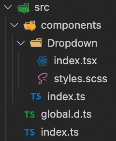
Firstly, it’s time to add some more structure to our library. We’ll need a components folder, as well as a folder for our Dropdown. Let’s also add a stylesheet for our component that will be used later.
NOTE: Since we’re going to import SCSS, we’ll need to configure a global.d.ts file to tell the parser to understand files with that extension.
declare module '*.scss' {
  const classes: {[key: string]: string};
  export default classes;
}
After this, our library src structure should be as follows:
So, for our Dropdown component, we’re going to need to pass it 2 props at least: a button and some content through its children. Let’s see how it will look:
import React, {useEffect, useRef, useState} from 'react';
import classNames from 'classnames';
import styles from './styles.scss';

type DropdownRenderer = {
  isOpen: boolean,
  toggleOpen: () => void,
};

type DropdownProps = {
  button: React.ReactNode,
  children?: ({isOpen, toggleOpen}: DropdownRenderer) => React.ReactNode | React.ReactNode,
}

type DropdownButtonProps = {
  refProp: React.RefObject<HTMLButtonElement>,
  isOpen: boolean,
  toggleOpen: () => void,
  children?: React.ReactNode,
}

type DropdownContentProps = {
  refProp: React.RefObject<HTMLDivElement>,
  children?: React.ReactNode,
}

export const Dropdown = ({
  button,
  children,
}: DropdownProps) => {
  const [open, setOpen] = useState(false);
  const buttonRef = useRef<HTMLButtonElement>(null);
  const contentRef = useRef<HTMLDivElement>(null);

  const toggleOpen = () => setOpen(isOpen => !isOpen);

  return (
    <div className={classNames(styles.dropdown)}>
      <DropdownButton
        refProp={buttonRef}
        isOpen={open}
        toggleOpen={toggleOpen}
      >
        {button}
      </DropdownButton>
      {open && (
        <DropdownContent
          refProp={contentRef}
          className={dropdownClass}
        >
          {typeof children === 'function' ? children({isOpen: open, toggleOpen}) : children}
        </DropdownContent>
      )}
    </div>
  );
};

const DropdownButton = ({
  refProp,
  isOpen,
  toggleOpen,
  children,
}: DropdownButtonProps ) => {
  const buttonClass = classNames(
    styles.dropdown__button,
    {[styles['dropdown__button--open']]: isOpen},
    className,
  );

  return (
    <button
      ref={refProp}
      className={buttonClass}
      type="button"
      onClick={toggleOpen}
    >
      {children}
    </button>
  );
};

const DropdownContent = ({
  refProp,
  className,
  children,
}: DropdownContentProps) => (
  <div ref={refProp} className={classNames(styles.dropdown__content, className)}>
    {children}
  </div>
);
There we go, a simple dropdown component that renders a clickable button and content that can be toggled.
Obviously, this quickly becomes more verbose than it used to be with Bootstrap, but on the bright side, at least now we can use our new component anywhere in a much more simple way.
Alright, it’s nearly time to wrap up, so let’s talk about the elephant in the room: CSS Modules.
There are plenty ways to style components nowadays: inline CSS, CSS in JS, Styled Components, CSS Modules, and, ultimately, normal CSS.
I opted for CSS Modules because it makes it easy to write normal CSS in separate files and still use it in a JS-way, by importing the styles as an object with all the available classes. It just requires some extra Rollup configuration, which I’ll cover now.
Earlier I skipped over the Rollup settings necessary to make our CSS Modules work, but let’s include this in our configuration:
postcss({
  plugins: [
    postcssPresetEnv(),
    autoprefixer(),
  ],
  autoModules: false,
  onlyModules: false,
  modules: {
    generateScopedName: (name, filename, css) => {
      if (filename.includes('global')) {
        return name;
      }
      const hash = stringHash(css).toString(36).substring(0, 5);
      return `test_${name}_${hash}`;
    },
  },
  extract: 'css/test-library.min.css',
  extensions: ['.scss'],
  use: ['sass'],
  minimize: true,
  sourceMap: false,
}),
With this configuration, our final distribution CSS will be exported in a single file, containing all classes used throughout our library. Each class name is slightly changed in this process, to include a prefix and a hash, so as to make sure we never run into conflicts when importing our library in other places.
NOTE: It’s very important that we set autoModules and onlyModules as false, otherwise the modules will neither be exported nor used correctly in our components.
Publishing to NPM
For the final step, we just need to publish our library on NPM, so that we can install it in other places. Simple enough, let’s just run the following command, in the library’s root directory, where the package.json is:
npm publish --access publicWrap up
Yep, that’s it. That’s all there is to starting your own React components library.
There are a lot of different things you can now build upon too, like creating and exporting your own custom hooks, SVG and font assets, fully customised stylesheets, among many others.
For a future article, I’d also like to present a possible way to keep your library up to speed with tests and even Storybook.
I work as a full-stack developer at Runtime Revolution, where we focus on developing the best solutions for our clients’ problems.
I’m also somewhat of a computer geek and game “afficcionado”, both of which lead me to reading and being up-to-date with the latest news in the world of technology and gaming.