
In today’s fast-changing technological world, it is essential to turn data into valuable insights. In the past, this task often fell on software developers who had to find ways for data analysts to organize and sift through vast amounts of data. However, things are changing with the rise of user visualization tools that don’t require coding experience.
To thoroughly explore and understand the pros and cons of these platforms, we decided to create a simple project with a use case related to the consulting industry, where companies are connected through projects. In our search for such tools, we prioritized the ones that are easy to set up and allow data to be filtered, sorted, and shown in different kinds of graphs and maps without much effort.
Among the more promising tools, we considered Google’s Looker Studio, Qlik’s QlikView, and Kumu. We tested all three but ended up focusing more on Kumu due to its user-friendly design and straightforward setup compared to the other platforms. In this post, we dive into the different Kumu functionalities, such as data integrations, different types of views, search and filter functionalities, and how Kumu differs from its competition.
The source code from our project can be found at the end, so you can use it as a template.
What Is Kumu?
Kumu.io is a web-based framework that allows users to analyze and engage with data easily through visually appealing and customizable maps and diagrams.
Since it doesn’t require programming skills, Kumu is accessible to every type of user. However, for those more technically-oriented, Kumu also provides an advanced-settings feature that allows users to further customize the views through an internal stylesheet language. The stylesheet properties list is available in the official documentation.
Kumu’s Capabilities [Creating a Sample Project Using Kumu]
As a use-case scenario, let’s imagine a practical example where we want an easy way to display the relationships between companies and customers represented by the projects they have collaborated on.
Instead of manually inputting the dummy data through Kumu’s UI, we can use the available Google Sheets integration, which automatically updates the views in Kumu every time the Google Sheets file is updated.
Google Sheets [Using Google Sheets as a Data Source]
In the Google Sheet used to define the data, there are two required sheets: “Elements” and “Connections”, that represent the different entities within the system and their connections, respectively.
In the sheet “Elements”, there is a column named “Label” that contains the name of each element represented in its respective row. Each element is categorized using the “Type” column. In our use case, we have elements with a type of “Company”, “Customer”, and “Product”.
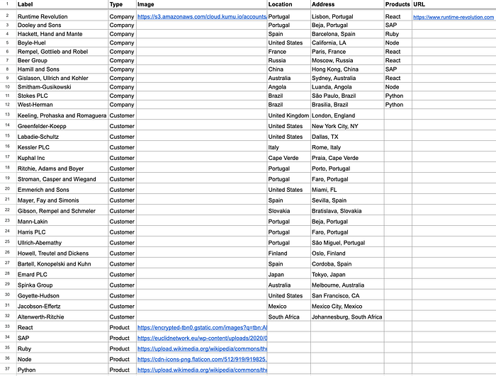
In the “Connections” sheet, the connections between elements are specified using a source (From) and a target (To), as well as the Type of the connection.
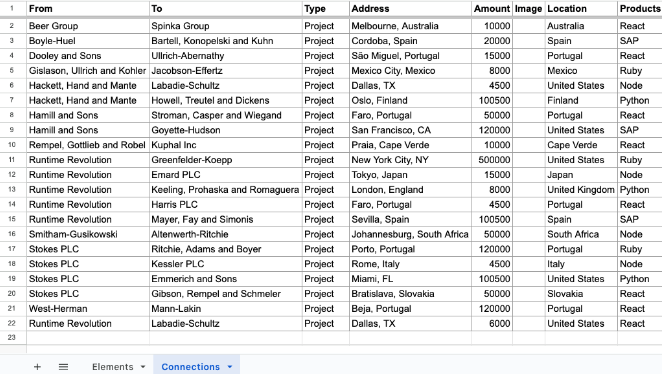
Additional columns can be added to both sheets, which will be automatically added to Kumu’s list of fields.
Data Visualisation [Creating Views]
To demonstrate some of the types of views that Kumu offers, we have created a view with three sub-views:
- Group by Company — Groups the connections by company;
- Group by Product — Groups the companies by the products they offer;
- Geographic Map — Displays the companies and customers in their geographic location.
The sub-views can be added to Kumu using the advanced editor by adding each sub-view setting inside an object @view. This allows each view to have its own configurations.
/* Advanced Editor - View toggle controls */@view 'Group by Company' {
/* Settings for this specific view */
}@view 'Group by Product' {
/* Settings for this specific view */
}@view 'Geographic Map' {
/* Settings for this specific view */
}@controls {
toolbar: true; top {
view-toggle {
label: "Views";
as: buttons;
default: "Group by Company";
}
}
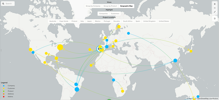
}Group by Company View
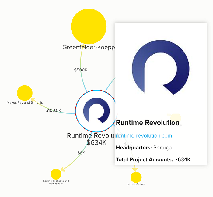
For this specific view, we used Kumu’s “stakeholder” template, which displays the entities as well as the connections between them.
The image below reveals that Companies are shown as blue circles and the Customers as yellow circles. We can also add custom images to the elements, like the “Runtime Revolution” logo, by having the image URL in the data source. The arrows connecting the companies and the customers represent the projects that exist between them.
The labels on the elements and connections can be stylized using markdown syntax, and the text can be customized to display data from any of the fields of that specific object.
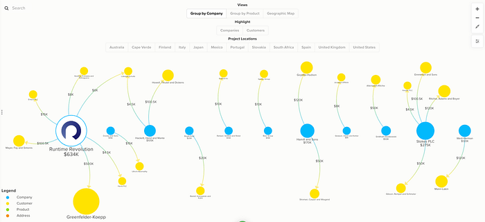
As the graph grows in size and complexity, the “Focus” functionality comes in handy to concentrate on specific elements and, thus, reducing the amount of clutter on the screen. This can be performed by right-clicking an element and selecting the “Focus” option.
In “Focus” mode, the view looks like the following image, and the URL in the browser updates with a key representing the focused element.
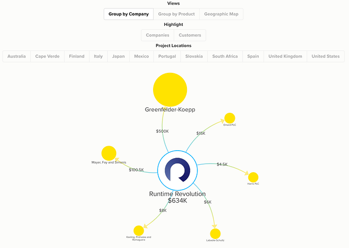
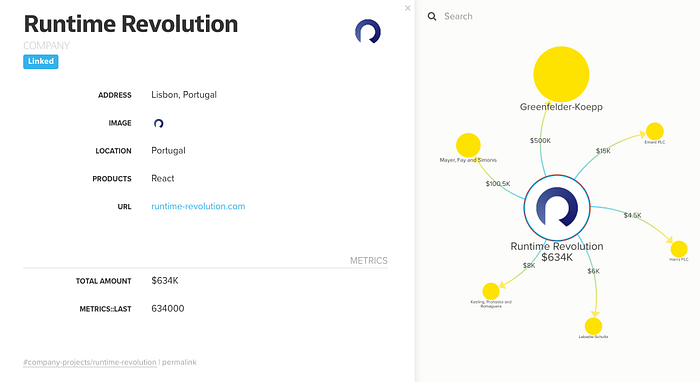
A popover can be added when an element is hovered over to display any kind of information we want. In this case, we are showing a simple card with the logo, name, website URL, location, and the sum of the amounts across all projects. The popover data can be customized using markdown or HTML tags.
As an alternative to the hover popover, an element or connection can be clicked to display the complete list of data in a more detailed and structured way. Doing this opens a drawer on the left side of the screen with all the fields set as visible in the project settings.
Kumu provides some ways of searching and filtering the data:
- Search bar — The search bar at the top allows the user to select an element by name quickly, showing its data and centering it on the screen. There’s also an advanced search option using Kumu selectors to perform more complex searches.
- Filter — Filters can be added as buttons to the view or configured as a default in the view settings. When a filter is applied, only the relevant elements and connections are shown.
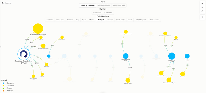
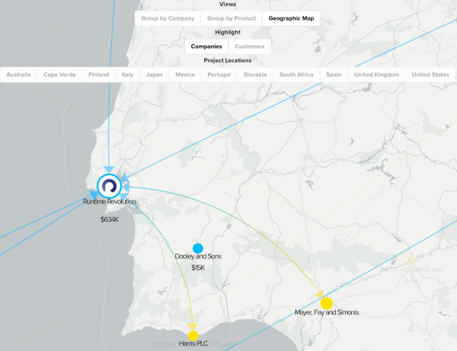
- Showcase — Showcases are similar to filters in the way they are configured, but the main difference is that the elements and connections that are not selected are shown with a transparency filter instead of fully disappearing. In our use case, we used this functionality to highlight the projects in specific locations. This example can be seen in the following image.
/* Group by Company view settings */@view 'Group by Company' {
@settings {
template: stakeholder;
element-color: categorize("Element Type", neon2);
element-scale: scale("total amount", 0.5, 2);
include: customer, company, project-connection, loop;
layout-preset: dense;
}
company {
position: line(0, 0, 0, 200, auto);
}
connection {
label: "{{amount}}";
popover: "**Products:** {{products}} **Location:** {{location}}
**Amount:** {{amount}}";
} @controls {
top {
view-toggle {
label: "Views";
as: buttons;
default: "Group by Company";
}
showcase {
label: "Highlight";
as: buttons;
multiple: true;
default: select-none;
mode: normal;
option {
label: "Companies";
selector: Company;
}
option {
label: "Customers";
selector: Customer;
}
}
showcase {
label: "Project Locations";
target: connection;
by: "location";
as: buttons;
placeholder: "Location";
multiple: true;
default: show-all;
mode: direct;
}
}
}
}Group by Product View
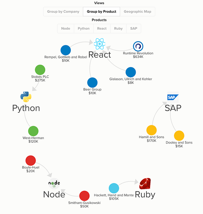
Similar to the “Group by Company” view, the stakeholder template was likewise applied to this group. The companies are filtered by offered products, which is one of the fields in the data source. The information can be grouped and filtered using any of the fields in the elements or connections.
We added a button for each product that highlights the elements connected to it when clicked, using the showcase functionality.
/* Group by Product view settings */
@view 'Group by Product' {
  element["element type"="Product"] {
  position: circle(0, 0, 100, auto);
} @settings {
cluster: "Products";
include: product, company, connection;
element-color: categorize("Products", olympic);
}
product {
scale: scale("degree", 5, 10);
color: transparent;
popover: "#### {{label}} ({{connections}}) {{image}}";
popover-padding: 3;
shape: rectangle;
position: circle(0, 0, 300, auto);
}
company {
size: 20;
}
@controls {
top {
view-toggle {
label: "Views";
as: buttons;
default: "Group by Company";
}
showcase {
label: "Products";
target: element;
by: "products";
as: buttons;
multiple: true;
default: select-none;
mode: normal;
}
}
}
}Geographic Map View
The data can also be displayed on top of a geographic map using the template “geo” if the elements have any sort of location field. The location of each element can be defined using different formats, such as latitude and longitude, country, city, or even specific addresses.
In our use case, the companies and customers have the field “Address” in the format “City, Country” so in the view settings we need to set the cluster and geo-location properties to “address”.
In the geographic map template, the same search and filter functionalities as those of the stakeholder template can be used to refine the data shown.
Similar to the views “Group by Company” and “Group by Product” views, the elements and connections can be customized to show data such as the name, total amount, and image. However, to reduce screen clutter, this information is only shown when zooming in on the map.
/* Geographic Map view settings */@view 'Geographic Map' {
@settings {
template: geo;
element-color: categorize("Element Type", neon2);
include: company, customer, project-connection,
location-connection, loop;
cluster: "Address";
element-scale: scale("total amount", 2, 5);
geo-location: "address";
geo-style: auto;
theme: light;
renderer: canvas;
} @controls {
toolbar: true;
top {
view-toggle {
label: "Views";
as: buttons;
default: "Group by Company";
}
showcase {
label: "Highlight";
as: buttons;
multiple: true;
default: select-none;
mode: normal;
option {
label: "Companies";
selector: Company;
}
option {
label: "Customers";
selector: Customer;
}
}
filter {
label: "Project Locations";
target: connection;
by: "location";
as: buttons;
placeholder: "Location";
multiple: true;
default: show-all;
mode: loose;
}
} bottom-left {
legend: {}
}
}
}Under the hood

Kumu is hosted on Amazon Web Services (AWS) servers and stores each project’s data inside an Apache CouchDB database. Users or companies that do not want to use it are able to obtain a Virtual Machine to use as a self-hosting environment so that their sensitive data remains secure.
The datasets are updated in the framework by importing XLSX, CSV, or JSON files or by linking directly to Google Sheets or a public JSON file. The linking approach has the advantage of automatically updating the data every time a Kumu view is opened.
By having a public Google Sheet, crowdsourcing is made possible without needing to assign roles to each user. However, in cases of sensitive or private data, admins can use an OAuth import integration with Google Sheets to protect the data.
Unfortunately, Kumu does not provide any API so if you want to update the data automatically in Kumu without manually updating the Google Sheets, you must implement an automated system to fetch and update the data. This solution can be implemented synchronously (using the Google Sheets API) or asynchronously (using Google Apps Script).
Web App Integration
By now, you might be wondering how to add the views you’ve created in Kumu into your website. This is as easy as copying the iframe provided by Kumu into your page’s HTML. You can generate the iframe code at any time by clicking on the “Embeds” option in the Kumu project settings. The embedded URL is public, but there is a paid option to privatize and encrypt the project with a password to prevent anyone form sharing the link with unauthorized parties.
The project can be exported as PDF, PNG, XLSX, or JSON.ThePDF and PNG formats will export the current view as an image, XLSX will contain the elements and connection data and JSON will export a backup of the whole project, including the configurations and data.
URL Parameters
Kumu provides “slugified” query parameters that can be added to the URL to interact with the view programmatically.
A sample project URL composition is always described as: https://kumu.io/[USER_NAME]/[PROJECT_NAME]#[MAP_NAME]/[VIEW_NAME]/[ELEMENT_NAME]
As an example, we can use the URL below to programmatically focus the element represented in the ELEMENT_NAME parameter by adding the query ?focus=1 at the end. This achieves the same effect as if the user clicked the focus button.
Example: https://kumu.io/user-name/project-name#company-projects/runtime-revolution?focus=1
It’s an amazing feature, but it only manipulates the view. As a matter of fact, Kumu does not currently have any API.
The views are static once rendered, so you won’t be able to add or remove settings, which, depending on the use context, might not come as a big issue since the whole point of Kumu’s custom UI controls (like the above view toggles) is to add some degree of interactability.
However, when it comes to user experience, there is a major caveat related to the embedding.
The project data does not have real-time update, so if it is changed in the data source, you will need to reload the page to show it on Kumu’s view.
Additionally, there’s currently no session handling, so the password for private projects needs to be inserted every time the page is reloaded. This is a major flaw that profoundly affects user experience, especially if you have the embed in a page that is frequently reloaded.
To overcome this, you might think: “Well then, I’ll just programmatically add the password”. But, unfortunately, if you use a language like JavaScript to access the password field on the <iframe>, it would be considered cross-site scripting 🏴☠️ and it will be blocked by the browser.
Other Alternatives
We explored some other no-code tools that allowed data visualization using graphs, tables, or maps, but none were as visually appealing as Kumu. However, we did find some more complete tools that may be useful if we need to handle more complex sets of data or if we would rather display it using charts or tables.
Qlik
Qlik provides a tool called QlikView that allows users to integrate a vast variety of different data sources and then create dashboards to visually represent the data charts, tables, or maps.
Compared to Kumu, Qlik provides a more serious, corporate look to and offers a larger set of display options.
Pros
- Wide range of data-source integration types;
- Auto-chart option to generate the most relevant chart according to the data fields provided;
- Reliable company that has been in business for over 30 years.
Cons
- Can be too complex to learn or use with simpler data sets;
- Not as dynamic as Kumu in regards to the custom styling options.
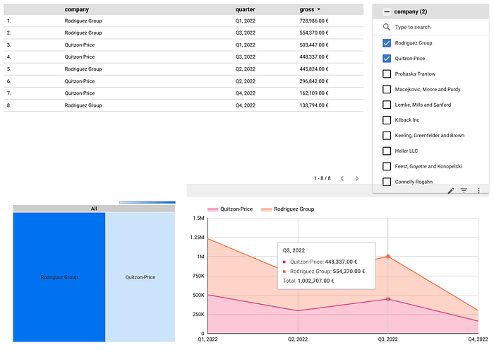
Looker Studio
Looker Studio allows users to create dashboards with multiple pages. Each has multiple charts that can be connected. This flexibility allows the user to engage in a wide variety of ways to display and filter data.
The biggest disadvantage that we found was in the security options. If a report is private, a user has to be logged into a Google account and be granted access to see the embedded charts. These requirements may compromise the usability of the tool for use cases with an extended list of authorized people or if that list changes frequently.
While Looker Studio is free, Google also provides a premium paid tool called Looker that integrates with Looker Studio to add more features such as a variety of APIs, single sign-on (SSO) for the embeds, and the ability to create custom data models using its own modeling language called LookML.
Pros
- Over 700 data source integration options;
- Creation of reports with charts connected to each other, which can be useful for applying filters;
- Access to charts developed by the community and the ability to create custom ones.
Cons
- User’s Google accounts need to be manually whitelisted to access the reports since the single sign-on authentication option is only available with a Looker paid subscription.
Conclusion
From our experience with the app, we gotta say that Kumu is one of the best low-code chart tools that we’ve experienced so far in terms of usage and design. Its simplicity (compared to tools like Tableau or PowerBi), makes it accessible for everyone to compose graphs or charts and capable of using big or smaller datasets without compromising the graph’s readability.
As such, we recommend it to users or companies that want to showcase their data in a simple and interactive way without much development effort. However, beware that if your project contains data that should not be made public, you need to find solutions that work best for you in terms of user access and usability.
Kumu Project’s JSON [Appendix]
The JSON exported from our project is available to download at Github.
To use our project as an example, save the JSON as a file and then follow the steps in the official documentation.